CSSを使って要素を六角形にする方法をご紹介いたします。
画像を使わなくても六角形を実装できるので、背景色を変えたい時などにCSSの修正のみで対応できるようになります。
Table of Contents
CSSのみで六角形を実装する方法

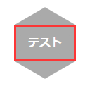
上記のような六角形を実装します。
まず、HTMLは以下のように記述します。今回はdivにしていますが、リンク等でもOKです。
<div class="hexagon">
  <div class="hexagon_cont">
    テスト
  </div>
</div>
CSSは以下のようにします。
.hexagon {
  width: 88px;
  height: 50px;
  background: #aaa;
  position: relative;
}

.hexagon_cont {
  height: 100%;
  font-size: 16px;
  font-weight: bold;
  color: #fff;
  display: flex;
  justify-content: center;
  align-items: center;
  position: relative;
  z-index: 1;
}

.hexagon::before,
.hexagon::after {
  content: "";
  width: 100%;
  height: 100%;
  position: absolute;
  top: 0;
  left: 0;
  background: #aaa;
  z-index: 0;
}

.hexagon::before {
  transform: rotate(60deg);
}

.hexagon::after {
  transform: rotate(-60deg);
}
六角形の大きさは.hexagonのwidthとheightで調整します。widthとheightで指定した値は、以下画像の赤枠部分に反映されます。
あとは、::beforeと::afterで同じ大きさの長方形を作って、それを傾けることで六角形を実現しています。
上部が平坦な六角形にしたい場合
.hexagonのwidthとheightの値を逆にすれば、上部が平坦な六角形にできます。
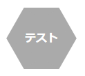
CSSは.hexagonのwidthとheightを逆転するだけでOKです。上述した六角形は横長の長方形を傾けているのに対して、以下は縦長の長方形を傾けて六角形を実装しています。
.hexagon {
  width: 50px;
  height: 88px;
  background: #aaa;
  position: relative;
}

.hexagon_cont {
  height: 100%;
  font-size: 16px;
  font-weight: bold;
  color: #fff;
  display: flex;
  justify-content: center;
  align-items: center;
  position: relative;
  z-index: 1;
}

.hexagon::before,
.hexagon::after {
  content: "";
  width: 100%;
  height: 100%;
  position: absolute;
  top: 0;
  left: 0;
  background: #aaa;
  z-index: 0;
}

.hexagon::before {
  transform: rotate(60deg);
}

.hexagon::after {
  transform: rotate(-60deg);
}
あとがき
複雑そうに見えますが、やってみると意外に簡単です。ぜひ参考にしていただけると幸いです。


コメントを残す