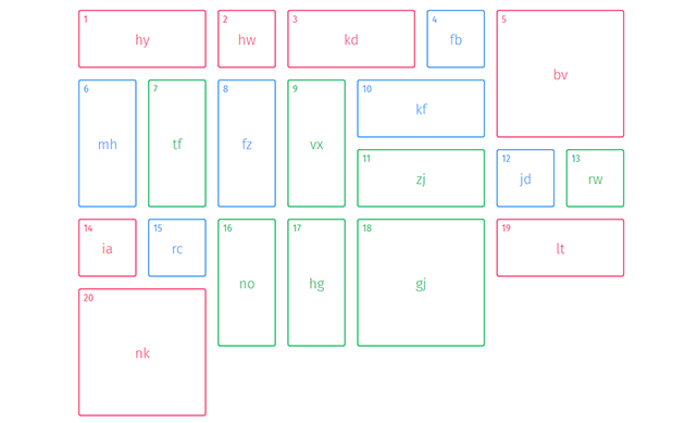
Muuriは、Pinterest風のレイアウトを実現することができるMasonry系のスクリプトです。
表示や動きについては、デモページでご確認いただけます。
Muuriの使い方
Muuri・Velocity・Hammer.jsのダウンロードと設置
Muuriを利用するには、VelocityとHammer.jsも必要なので、それぞれGitHubからダウンロードします。
サーバーに設置したスクリプトをそれぞれ読み込みます。
<script src="velocity.js"></script>
<script src="hammer.js"></script>
<script src="muuri.js"></script>
要素のマークアップ
各要素は以下のようにマークアップします。
<div class="grid">

 <div class="item">
 <div class="item-content">
 This can be anything.
 </div>
 </div>

 <div class="item">
 <div class="item-content">
 <div class="my-custom-content">
 Yippee!
 </div>
 </div>
 </div>

</div>
gridで全体を内包し、各アイテムはitemクラスとitem-contentクラスで内包します。
CSSの追加
CSSには、以下をそのまま追加します。
.grid {
 position: relative;
}
.item {
 display: block;
 position: absolute;
 width: 100px;
 height: 100px;
 margin: 5px;
 z-index: 1;
}
.item.muuri-dragging,
.item.muuri-releasing {
 z-index: 2;
}
.item.muuri-hidden {
 z-index: 0;
}
.item-content {
 position: relative;
 width: 100%;
 height: 100%;
}
スクリプトの初期化
最後にスクリプトを初期化して実行させます。
<script>
var grid = new Muuri({
 container: document.getElementsByClassName('grid')[0],
 items: [].slice.call(document.getElementsByClassName('item'))
});
</script>
記述場所は、</body>の直前でOKです。
あとがき
レスポンシブにも対応していて、ブラウザの幅を縮めていくと、アニメーションしながら要素が移動していくのがいい感じですね。
なお、Muuriにはオプションも用意されています。詳しくはGitHubの説明をご参照ください。


コメントを残す