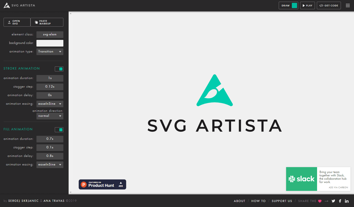
SVG Artistaは、SVGに適用するアニメーションを作成できるWEBサービスです。
プレビューで動きを確認しながら値を設定していけるので、そんなに知識がなくても簡単にSVGアニメーションを作成できます。
SVG Artistaの使い方
SVG Artistaにアクセスして、「OPEN SVG」から作成したSVGファイルをアップロードします。「PASTE MARKUP」からインラインSVGのコードを貼り付けてもOKです。
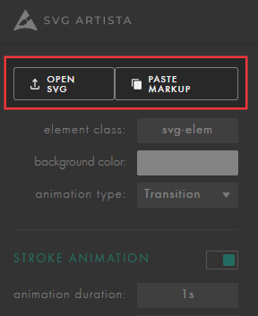
SVGが読み込まれたら、各種アニメーションの設定を行っていきます。
設定できる内容は以下の通りです。各種設定の値を変更すると、リアルタイムでプレビューがアニメーションします。
| element class | クラス名 |
| background color | 背景色(プレビューのみ) |
| animation type | アニメーションの種類 |
| animation duration | アニメーションが完了するまでの時間 |
| stagger step | 個々の要素のアニメーション実行タイミングをずらす |
| animation delay | アニメーションが実行されるまでの遅延時間 |
| animation easing | イージングの種類 |
| animation direction/td> | アニメーションの再生方向 |
アニメーションの設定は、「STROKE ANIMATION」と「FILL ANIMATION」に分かれていて、STROKEは外側の枠線、FILLは中の塗りつぶし部分のことです。それぞれ別々にアニメーションを指定します。
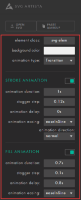
アニメーションの設定が完了したら、右上の[GET CODE]をクリックして、SVGのコードとアニメーション用のCSSを取得しましょう。

SVGは[COPY SVG]、CSSは[COPY TRANSITION CODE]もしくは[COPY ANIMATION CODE]のボタンからコードをコピーできます。
ちなみに、CSSの上にある「Autoprefixer」にチェックを入れるとベンダープレフィックスが追加され、「Minify」にチェックを入れるとコードが縮小化されます。
今回用意したサンプルでSVGアニメーションを作成してみたら、以下のようなコードが生成されました。
<svg id="svg" data-name="svg" xmlns="http://www.w3.org/2000/svg" width="543.239990234375" height="228.97000122070312" viewBox="0 0 543.24 228.97">
  <defs>
    <style>
      .cls-1 {
        fill: #444343;
        stroke: #b2b2b2;
        stroke-miterlimit: 10;
        stroke-width: 8px;
      }
    </style>
  </defs>
  <title>svg</title>
  <g>
    <path class="cls-1 svg-elem-1" d="M307,576.19l-14.82-3.13a130,130,0,0,1-27.84-9.16A106.4,106.4,0,0,1,241,549.38l18.91-33.65a91.41,91.41,0,0,0,28.88,15.86,103.69,103.69,0,0,0,33.66,5.58q19.95,0,31-6.77t11-19.13v-.15q0-8.64-4.92-13.7a29.12,29.12,0,0,0-12.8-7.45,158.8,158.8,0,0,0-20.25-4.32,3,3,0,0,0-.82-.15,2.57,2.57,0,0,1-.82-.14l-3.28-.45q-21.74-3.42-36-8.56a53.06,53.06,0,0,1-24.27-18q-10-12.87-10-36.55v-.15q0-21,9.38-35.89T287.89,363q17.87-7.81,43.18-7.81a109.76,109.76,0,0,1,23.75,2.68,128.67,128.67,0,0,1,23.75,7.74,132.67,132.67,0,0,1,22,12.21l-17.27,34.54A109.87,109.87,0,0,0,357.2,399a79.2,79.2,0,0,0-26.13-4.76q-18.76,0-29,6.18t-10.28,17.34v.15q0,9.39,5.36,14.82a32.09,32.09,0,0,0,13.25,8,211,211,0,0,0,22.19,5.36,9.94,9.94,0,0,0,1.19.22c.4.05.79.13,1.19.22a17.36,17.36,0,0,1,1.72.38c.54.14,1.11.27,1.71.37q20.55,4,34.32,9.75a53.45,53.45,0,0,1,23,18.46q9.24,12.74,9.24,34.77v.3q0,20.7-9.68,35.44T367,568.44q-18.54,7.75-44.59,7.75Z" transform="translate(-235.86 -351.22)"></path>
    <path class="cls-1 svg-elem-2" d="M419.82,357.45h42l46,144.43,46-144.43h42L523.75,574H491.89Z" transform="translate(-235.86 -351.22)"></path>
    <path class="cls-1 svg-elem-3" d="M775.1,452.9v42.28q0,24.13-9.76,42.52a69,69,0,0,1-27.62,28.44q-17.87,10.05-41.39,10.05-23.69,0-41.77-9.46a67.58,67.58,0,0,1-28-26.73q-9.92-17.26-9.9-40.05V436.07q0-24.12,9.75-42.44A69.11,69.11,0,0,1,654,365.27q17.87-10,41.39-10a80.61,80.61,0,0,1,35.74,8,74.35,74.35,0,0,1,27.33,22.56,82.86,82.86,0,0,1,14.81,33.8H729.24a28.76,28.76,0,0,0-7.37-11.84,34.75,34.75,0,0,0-12.07-7.59,40.36,40.36,0,0,0-14.37-2.61,37.59,37.59,0,0,0-19.13,4.77,32.41,32.41,0,0,0-12.8,13.55A43.47,43.47,0,0,0,659,436.07V500a34.2,34.2,0,0,0,4.62,17.87,30.53,30.53,0,0,0,13.1,11.91,44.06,44.06,0,0,0,19.66,4.17,39.39,39.39,0,0,0,19.28-4.54,30.81,30.81,0,0,0,12.73-13.18q4.47-8.64,4.47-20.4v-3.57H700.05V452.9Z" transform="translate(-235.86 -351.22)"></path>
  </g>
</svg>
/***************************************************
 * Generated by SVG Artista on 8/28/2019, 9:24:02 PM
 * MIT license (https://opensource.org/licenses/MIT)
 * W. https://svgartista.net
 **************************************************/

svg .svg-elem-1 {
  stroke-dashoffset: 1033.5794677734375px;
  stroke-dasharray: 1033.5794677734375px;
  fill: transparent;
  -webkit-transition: stroke-dashoffset 1s cubic-bezier(0.47, 0, 0.745, 0.715) 0s,
                        fill 0.7s cubic-bezier(0.47, 0, 0.745, 0.715) 0.8s;
          transition: stroke-dashoffset 1s cubic-bezier(0.47, 0, 0.745, 0.715) 0s,
                fill 0.7s cubic-bezier(0.47, 0, 0.745, 0.715) 0.8s;
}

svg.active .svg-elem-1 {
  stroke-dashoffset: 0;
  fill: rgb(68, 67, 67);
}

svg .svg-elem-2 {
  stroke-dashoffset: 877.4727172851562px;
  stroke-dasharray: 877.4727172851562px;
  fill: transparent;
  -webkit-transition: stroke-dashoffset 1s cubic-bezier(0.47, 0, 0.745, 0.715) 0.12s,
                        fill 0.7s cubic-bezier(0.47, 0, 0.745, 0.715) 0.9s;
          transition: stroke-dashoffset 1s cubic-bezier(0.47, 0, 0.745, 0.715) 0.12s,
                fill 0.7s cubic-bezier(0.47, 0, 0.745, 0.715) 0.9s;
}

svg.active .svg-elem-2 {
  stroke-dashoffset: 0;
  fill: rgb(68, 67, 67);
}

svg .svg-elem-3 {
  stroke-dashoffset: 1075.115478515625px;
  stroke-dasharray: 1075.115478515625px;
  fill: transparent;
  -webkit-transition: stroke-dashoffset 1s cubic-bezier(0.47, 0, 0.745, 0.715) 0.24s,
                        fill 0.7s cubic-bezier(0.47, 0, 0.745, 0.715) 1s;
          transition: stroke-dashoffset 1s cubic-bezier(0.47, 0, 0.745, 0.715) 0.24s,
                fill 0.7s cubic-bezier(0.47, 0, 0.745, 0.715) 1s;
}

svg.active .svg-elem-3 {
  stroke-dashoffset: 0;
  fill: rgb(68, 67, 67);
}
アニメーションを実装するために、SVG側にもコードが追加されていました。
なお、上記をそのままHTMLとCSSに貼り付けると、「SVG」という文字がアニメーションします。

あとがき
プレビューを見ながらアニメーションを作成できるので便利ですね。SVGのアニメーションを一から自作するのは非常に面倒なので、こういうサービスはありがたいです。
SVGにアニメーションを実装したい時は、ぜひご活用ください。

コメントを残す